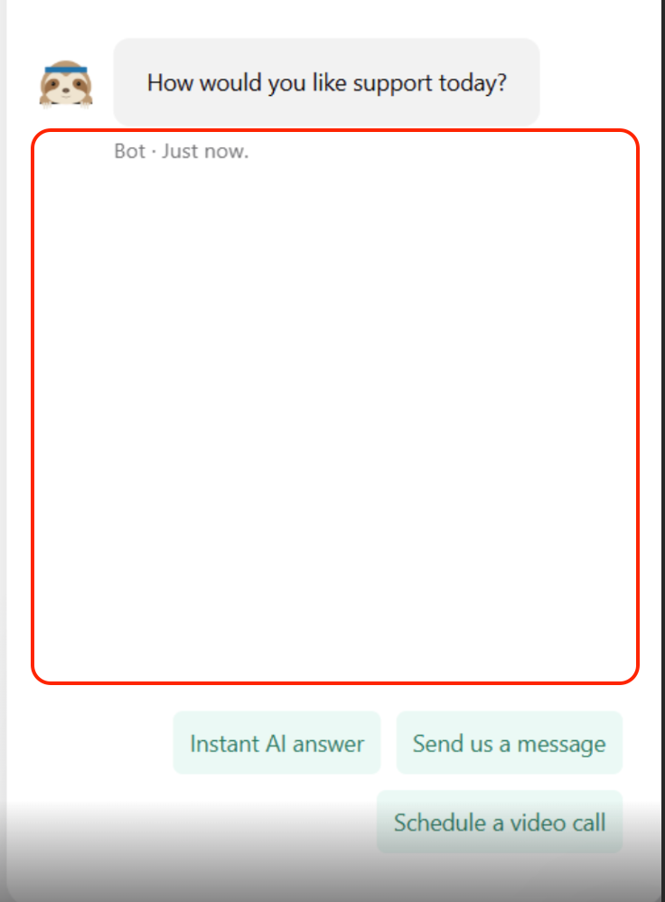
The message and button sections which are set in the workflow are somewhat not user-friendly in the chatbox with a huge spacing in between when the message is short. Is there anyway we can have the buttons appear below the message to make the chat-bot looks neat and easy for users to select?


