Which of your Mobile Carousels screens are performing best? 

To help you understand how your Mobile Carousels are performing, and where your users are dropping off, we’ve introduced new reporting features 🎉
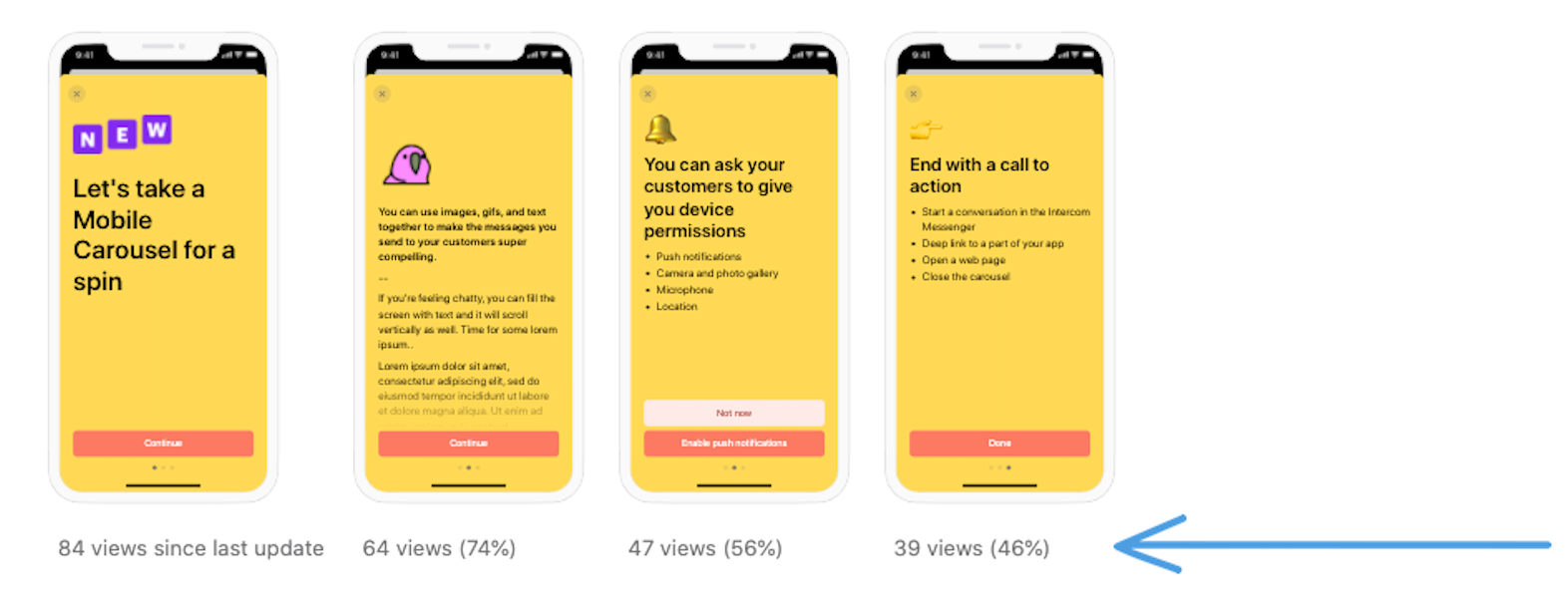
Screen Shot 2020-08-21 at 1.24.44 PM


You can now see where users are dropping off within a given carousel with view stats for each screen.


Check out your existing carousels to see how each screen is performing. We want to hear from you: which of your carousels, or specific carousel screens, are performing best?

I thought it might be kinda cool to share how we're using this feature at the moment. We're running an A/B test with the carousel we use to onboard new users in our iOS app, and screen view stats are an important part of it.


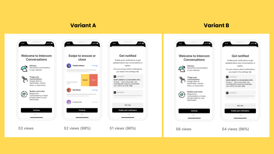
Here are the variants we're testing with. In variant B, we removed one of the screens. In variant A, we left it as it was.


Interconnected - Screen stats post assets

From this test we're trying to learn a few things:


  • Does viewing the carousel with the extra screen result in feature usage and, by extension, a better triage experience? (We'll test this with tracked events)
  • Does viewing that extra screen make you less likely to continue to the final screen? We definitely want people to see that last screen, as enabling push notifications is a strong signal that people will find the app useful. (We'll test this with screen view stats)
  • For the folks who see all of the carousel, does seeing the second screen/going through a slightly longer carousel make people more or less likely to enable push? (We'll test this with tracked events)


The screen view stats are really useful for helping us understand the second point. Before this feature, we'd have had to infer it based on the overall completion rate. That wouldn't give us any certainty over whether it was screen 1 or screen 2 that was the problem. Now we'll know.


We only just set this test live, so the numbers are too small to draw any conclusions. The very early indication is the 'swipe to snooze or close' screen in the carousel isn't having a negative impact. People are making it past the first screen at a good rate as well. Excited to see what we learn as this test progresses 😃