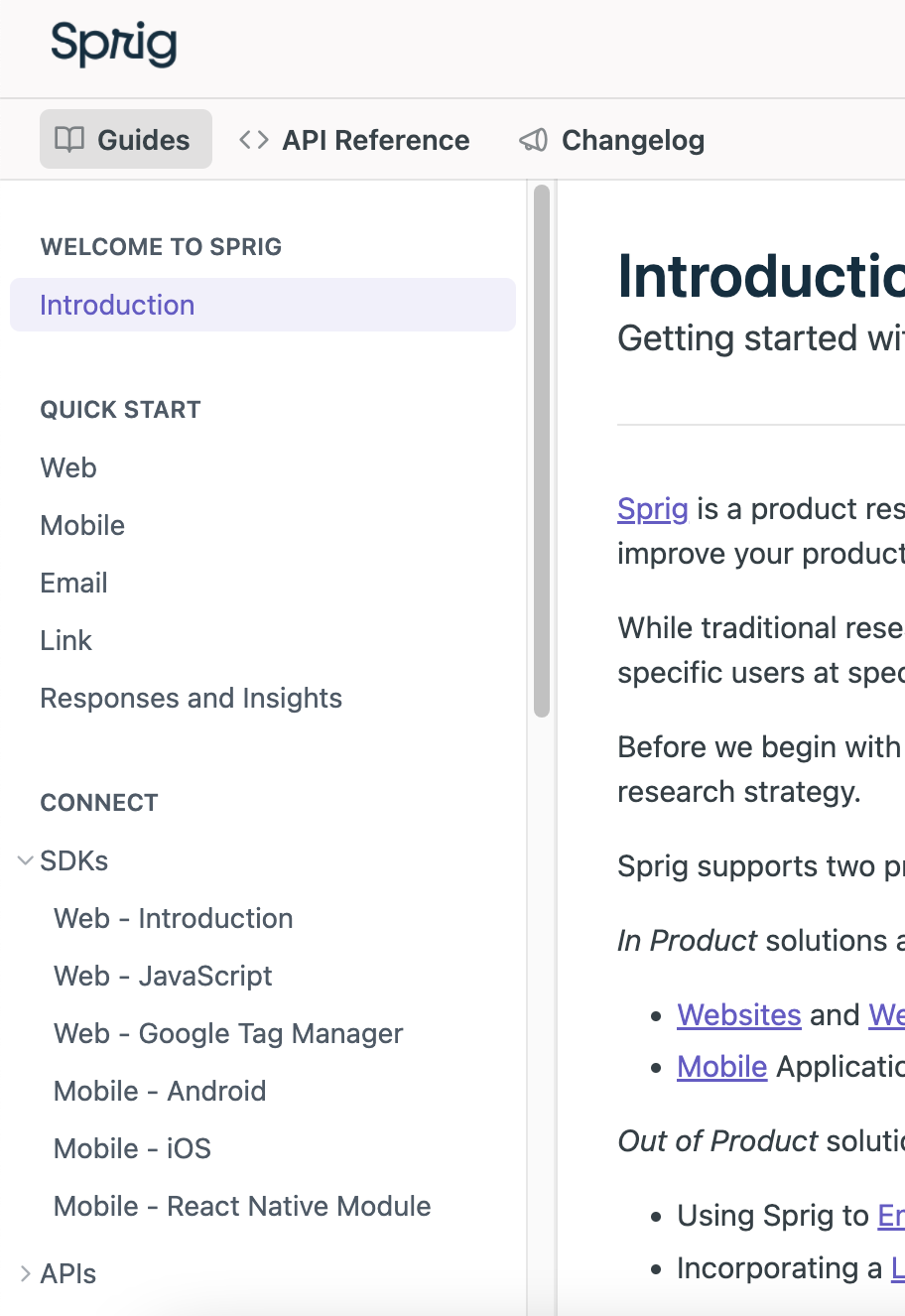
Navigating around our Intercom Articles is not easy, finding what you're looking for is mostly predicated on the search bar bringing the right article to the front.
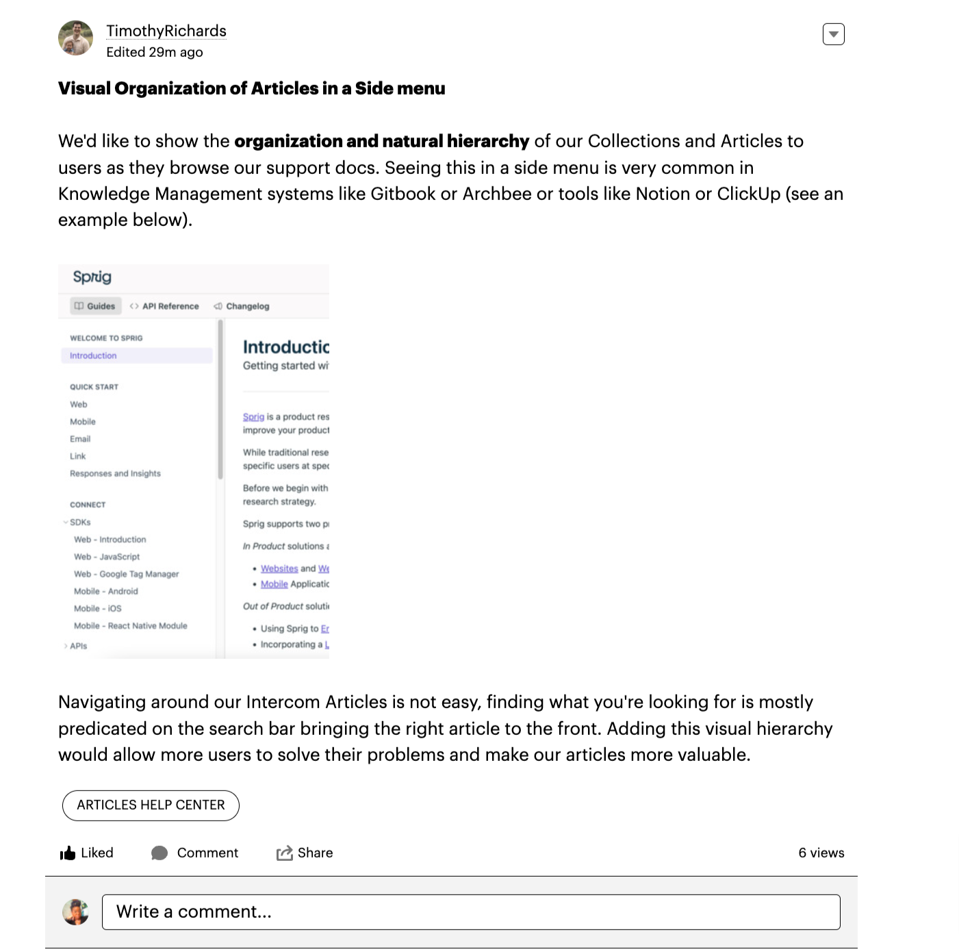
We'd like to show the organization and natural hierarchy of our Collections and Articles to users as they browse our support docs. Seeing this in a side menu is very common in Knowledge Management systems like Gitbook or Archbee or tools like Notion or ClickUp (see an example below).

Is there anyway that I could visually show users how our docs are organized so they can navigate it easier? Could this be done in Intercom or through the App Marketplace?


