Hi all, I have a question for super users and product experts around product tours and sticky headers. I LOVE product tours but we're not using them to anywhere near their potential due to an issue between our site's headers and how product tours scroll. We've followed all the articles to fix it and raised it a couple of times with Intercom support but I'm keen to know if anyone has dealt with this before or know's a trick that could somehow get it working for us.

To explain it further when you point to elements in your product tour steps and you're travelling down the page, the page scrolls perfectly, but as soon as you have to point back up to an element that you have scrolled past, the scrolling doesn't engage properly.


Pic below. In the top pic, (when editing the step) the element is selected properly and is how it should appear but it appears on our site like the second pic, where half the header is selected and half the element. We've tried all the "scroll-margin-top:" fixes in the articles but no joy.

Anyone have any thoughts?
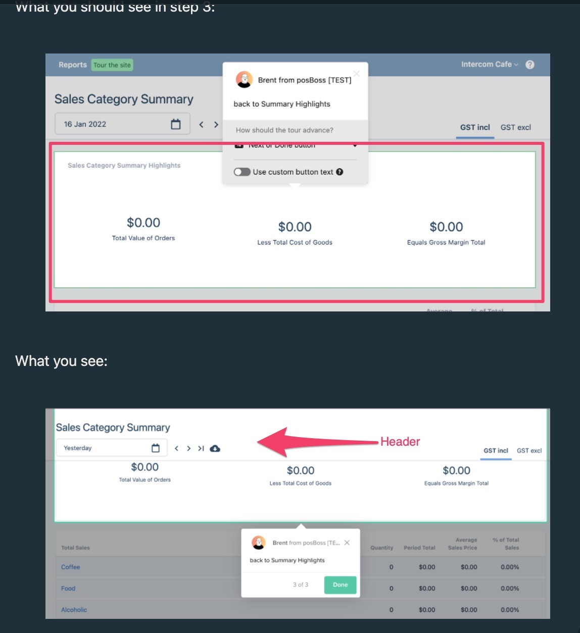
Sticky_headers_and_product_tour_not_working_properly

We also have the same issue and cannot find a solution. It seems like Intercom uses getBoundingClientRect() to get the element's screen position. This uses the element's true size, so the only way to change it would be to add a whole header's worth of padding on top of every element we'd want to scroll to, which does not seem reasonable.


Perhaps Intercom can add a settings option where we can manually set some offset or provide an id for sticky headers so the script can determine the offset?


Hey @brent w​ ! I'm Mat and I'm one of the Group Product Managers at Intercom. Thank you for your question 🙏 I chatted with @zoe s​ about this, and she had some thoughts to share.. hope they're helpful 👍


When displaying a product tour step, we try our best to make sure that the element we are pointing at is fully visible on the page. Generally, the strategy we use to achieve this is to scroll to the element we want to point at and try to vertically position the message in the centre of the page.


This works well most of the time, but there are however cases where other elements on the page can overlap the element we are pointing at, such as fixed headers or drop down menus, and there are some cases where the scrolling behaviour doesn’t stop exactly where we would like it to.


For the first case, we don’t know what elements on the page are sticky ahead of time, so we don’t have a good way of knowing if something is overlapping our target element without scanning every element on the page every time something changes (which could be very often on some sites).


For the second case, we should position the message in the centre of the screen. There are cases where the header will still overlap, especially if the window size or browser window is smaller. It does appear that there may be a bug where we don’t position the element in the middle of the page when scrolling up however that we need to look into.


Hey @brent w​ - One of our Engineers just dropped me a line to let me know that this issue should now be fixed. If you could test it out and let me know that resolves it for you, I'd be grateful?


Amazing! Thanks @Mathew Cropper​ I'll give it a try.

Apologies for the late response - we've had a big release of a new product I've been managing so I haven't been able to get here.


Oh and I got my Interconnected Swag too - Thanks team! @diana t12​ 


Reply