New Inbox initial thoughts...


I'm seeing a lot of unused space and the new inbox seems to "waste" quite a bit in comparison to the old version. I'm no longer able to see the detail I used to previously. I'm attaching a screenshot where I've colour-coded the section from the old version onto the new, and you can see how much detail has gone when you're actively working on a conversation...
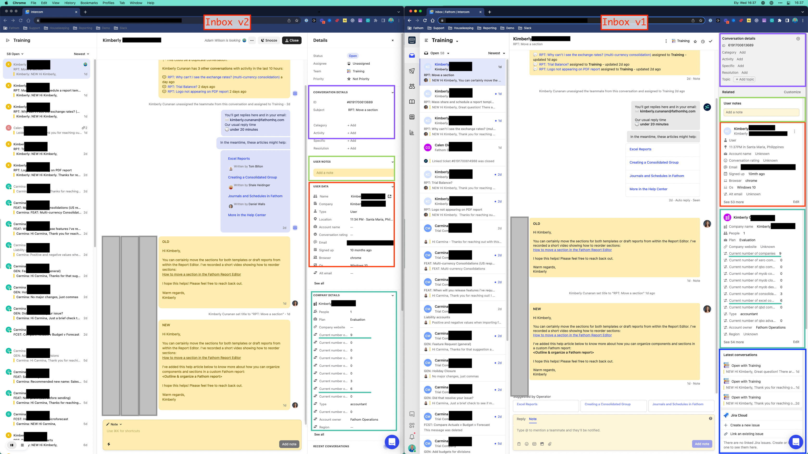
 

Inbox 1 vs 2 Shared

I second this! Overall really like the new inbox but the side panel seems harder to navigate for the right info now


Totally agree. Our support team relies heavily on the information in the side panel and with the new Inbox you have to dig for information which is slowing my work flow down. Having everything be in a drop-down menu feels like overkill.


I agree! I like the new inbox and all the keyboard shortcuts. However the sidepanel is not optimal. If we need to go to a customers page just by clicking on their name (which you could in the old inbox) its an almost impossibe task.


Agree. Shortcuts are hidden behind a click, Snooze/Close is replaced by giant buttons and Team info now takes up space on the right panel for no reason, panels overall take up more space for the same function.


It's now been two weeks and I am still not finding any benefit the new inbox. The old one served our needs, this one fights against our needs. We do not work solely in the Inbox. Maybe we're not the audience for this type of update?


Some challenges my team is having:


  • Mentions don't go away after we've read them.
  • The "New message from" wording in the tab doesn't go away until we refresh.
  • The user info from previous convos sticks around on new convos with different users until we refresh.
  • Everything is hidden behind multiple clicks if you don't use the keyboard commands. We don't solely use Intercom Inbox, so asking us to take hands off the mouse to do keyboard commands is actually slower.
  • Lots of little things we use are now hidden behind clicks, for example the "Inbox Events", which we want to see all the time, now we have to select it.
  • The bolding/unbolding seems inconsistent, and we preferred the subject and sender staying bold as it made it easier to pick out convos.
  • Search is almost unusable now. It jumps around on the page, loads for long periods, and doesn't seem to pull results like it used to.
  • On smaller displays, the convos are covered up by the Details panel unless you minimize either them or the Inbox. We use both constantly and don't want either minimized.
  • The dark mode is missing something compared to other dark modes. Not sure I can put my finger on what, but I only switch to it when I feel a migraine coming on.
  • I'm sure there are other things I'm forgetting...feels like a daily struggle and fight against the product, in any case.


It's not all bad though. We DO like the ability to send New Conversation emails to more than one person at a time.


Agree that not everything should be so keyboard command heavy and it slows things down for me as well. I have a certain workflow that requires me to leave Intercom frequently and jump into other tabs and apps so I have to use my mouse heavily.


Reply