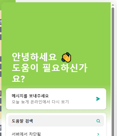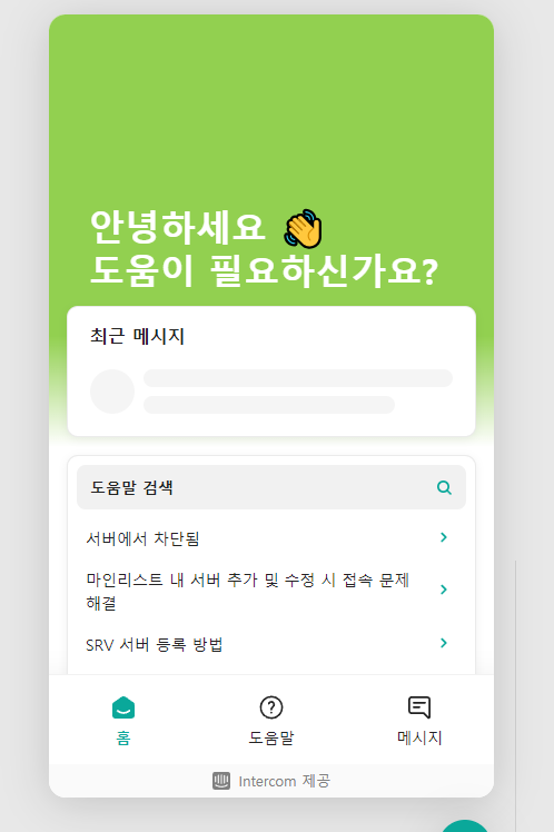
In Messenger setting page.
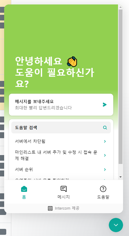


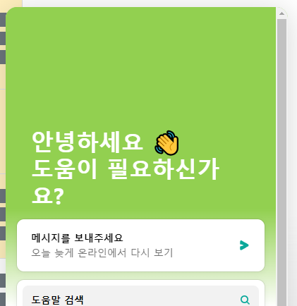
In production.


I want to show a two line welcome message. In settings page, it seems great. But, in production, it show me unnecessary scrollbar and it make unnecessary word break. 


I wonder if this is intentional or a bug and would love to see it fixed. If it is intentional, it would be nice to have the option to make the scrollbar thinner, or to adjust the font size of the welcome message.


안녕하세요 👋
도움이 필요하신가
요?

Hi @SeongHoon Ryu 

Jennifer here from Intercom

Can I ask what browser you are using? Is it Firefox or is this happening in all browsers? 🔍


@Jennifer K Yes! It happening in all browsers. I mainly using Chrome 116.0.5845.97.


Edge (i don’t use edge so it’s clean - no extension)


Chrome Incognito mode


Hi there @SeongHoon Ryu !


I’m able to replicate this on my own test site as well. I’ll make a Feature Request to our Product Team about that Font-Size suggestion!

For now, you’re best bet is to shorten your message enough so that there is a little bit of extra space for that scrollbar to be included in the Messenger.

Thanks for bringing that to our attention!


Reply