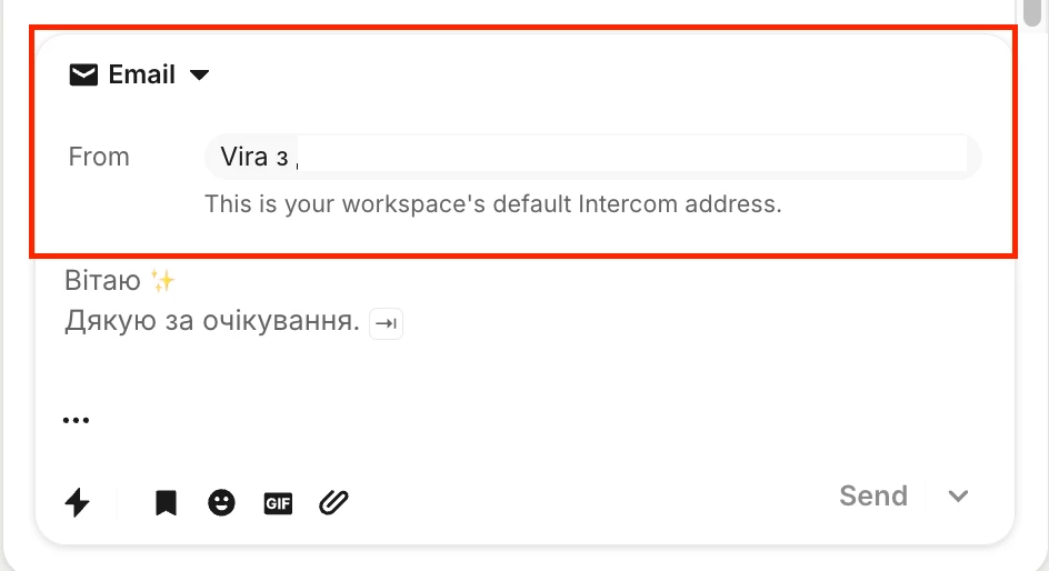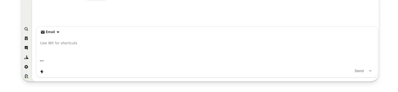


Recently, a new "From" field/line was added at the top of the chat panel with a customer. Unfortunately, this element takes up almost half of the visible screen area in the chat view.
While I understand this might have been introduced as part of a design refresh or to improve context visibility, in practice, it significantly hinders daily workflow:
-
Drastically reduced readable area: Agents now have to scroll constantly just to read brief message threads.
-
Slower response times: Managing multiple conversations becomes inefficient when key information and context are pushed out of the viewport.
Could you please consider making this header more compact, collapsible, or giving us an option to customize/hide it?