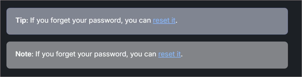


It’s really hard to tell the difference between blue and grey callouts in help articles when browsing in dark mode.
In the screenshot, the first Tip is blue and the second Note is grey. I usually test pretty well on color vision and I’m having trouble seeing the difference.
Seems like this would be an accessibility issue.