

color coding for priority markings | Community
Skip to main content
Submitted

color coding for priority markings

  • July 3, 2026
  • 4 replies
  • 103 views

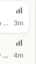
Would it be possible to add color coding to the priority markings to improve their visibility?
I believe this would make it easier to quickly identify and distinguish priorities at a glance.



4 replies

The yellow stars were much more visible. Yes, there was no gradations, but I at least could see them + it was 1 click option. Now 2 clicks + indistinguishible small grey lines. 


Color coding suggestion:

  • Urgent
  • High
  • Medium
  • Low
  • None —> remove icon at all

Also:

  • Make them bigger
  • Set “Low” automatically in 1 click and then dropdown.

Many times I don’t have grading priorities, but need to understand what chats are unanswered.


  • New Participant
  • July 3, 2026

I agree! Please! Add color😊


  • New Participant
  • July 6, 2026

Upvote. Need an easier way to tell priority and colors would be helpful


  • New Participant
  • July 7, 2026

Something i can’t Understand, while develop a feature for priority Levels🙈
 

the new priority indicator 📶 is not implemented very well. It’s hard to recognize the priority at first glance. Previously, we at least had the ⭐️.

Maybe it would be worth considering using colors instead, for example 🟡🟠🔴, because that would stand out immediately in the Messenger. Otherwise, it gets lost very easily.

Over the past few days, I’ve personally had several cases where I missed prioritized conversations because of this.

Best regards