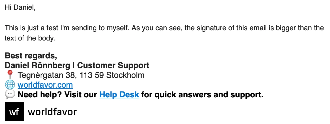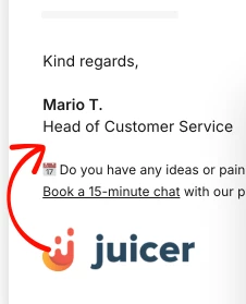




I’ve noticed a couple of issues with the email signature that impact its appearance and professionalism:
-
Font inconsistency: The font in the signature is larger and different from the rest of the email body, which makes it look mismatched and less polished.
-
Line spacing: When customizing the signature, I added intentional blank lines (e.g., between our website and “Need help?...”), but these are not reflected in the final version.
These limitations make it harder to present a consistent and professional brand experience. Allowing more flexible customization (e.g., consistent fonts, preserved spacing, and layout options) would make signatures look cleaner and ensure they align with the rest of the email design.