



I’d like to share some feedback regarding the current user experience of the Messenger widget – both from our customers and from my own experience when interacting with your support team.
1. Lack of clear message titles in conversations
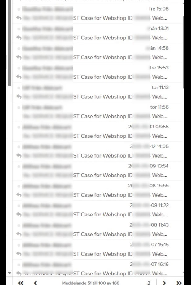
One of the most frequent complaints we receive is the difficulty in identifying which conversation is related to a specific topic. The absence of descriptive titles or labels on messages makes it hard to navigate and manage multiple threads, especially when several support issues are being handled simultaneously. Adding clearer visual cues or customizable conversation titles would be a big step forward in terms of usability.
2. Disruptive behavior when new messages arrive
Some of our users have also expressed frustration with the widget automatically popping up every time we or FIN send a reply. Many of them work actively in their admin interface, and this behavior interrupts their workflow. We’d appreciate the ability to customize the widget so that only a non-intrusive notification is shown, rather than the full widget opening automatically with each new message. Or is it already something we can do?
These improvements would really help create a smoother and less disruptive support experience for both our team and our end users.
Thanks for considering this feedback – we’re looking forward to seeing what’s next.