



The current behavior: When viewing a Help Center article inside the Messenger, the "Open in Help Center" link — which opens the article in a full browser tab — appears only at the very bottom of the article (screenshot below).
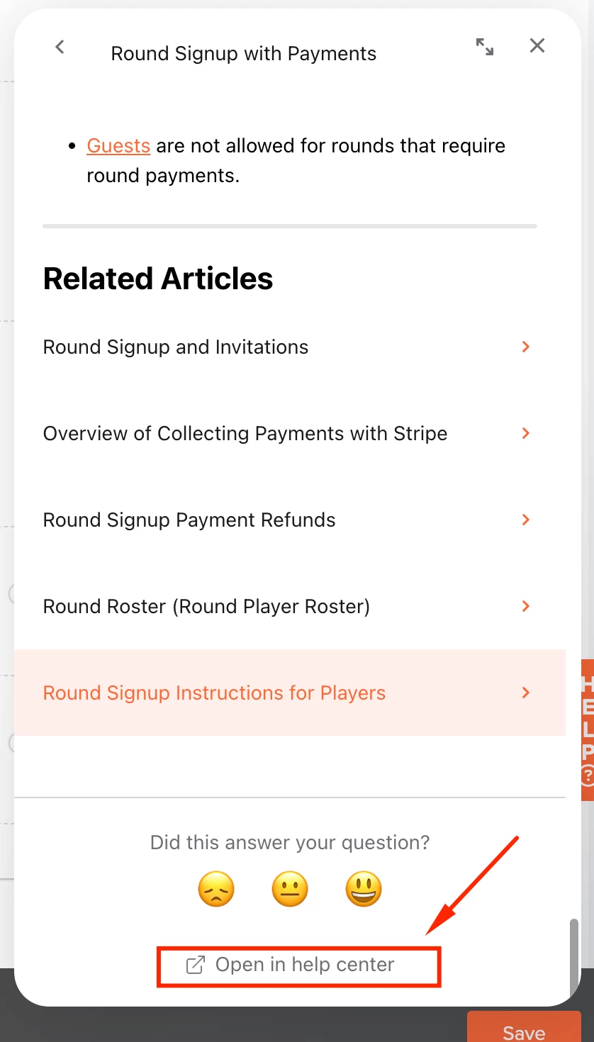
The problem: The users who most want to open an article in the full Help Center are the ones reading long articles — the Messenger pane is narrow, so long articles mean cramped screenshots, a squeezed table of contents, and a lot of scrolling. But to discover the "Open in Help Center" option, those users have to scroll through the entire article first. The link's placement is backwards relative to the people who need it: by the time they find it, they've already done the cramped reading it was meant to save them from.
The request: Show "Open in Help Center" at the top of the article as well — near or just below the article title (mockup below) — or give us a setting to choose its placement (top, bottom, or both). Keeping the bottom link is fine; readers who finish an article sometimes want the full URL to share or bookmark. The ask is simply that the option also be visible before someone commits to reading the whole article in the pane.
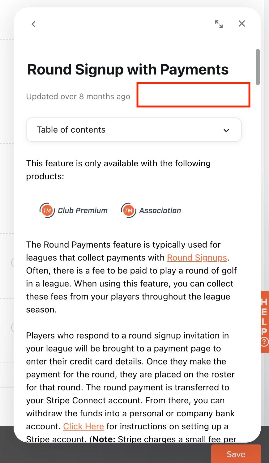
A lightweight alternative: even a small "open in new tab" icon in the Messenger article header would solve this without adding a text link that pushes content down — whichever fits the Messenger design best.
The payoff: users who prefer full-width reading get there in one click instead of after a full scroll, and long-form documentation becomes genuinely usable from the Messenger. Thanks for considering!