




Reporting: Custom KPI Charts | Community
Skip to main content
Submitted

Reporting: Custom KPI Charts

Related products:Reporting
  • August 30, 2024
  • 2 replies
  • 33 views

Pierre G
Forum|alt.badge.img+1

Being able to build custom KPI charts that take in simple mathematical formulas using the output of other charts.  This would allow us to have better control over the data we want to see in our reports.


Here is an example of what I mean.

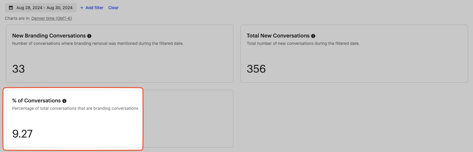
Currently I have two KPI charts, one that counts conversations with the tag “Branding” and one that counts all conversations regardless of their tag.

 

I’d like to build a third (custom) KPI chart that grabs both of these values and applies a mathematical formula.

(Chart1/Chart2)*100 = X

which is

(33/356)*100 = 9.27

and then output that number to my new custom KPI chart as seen below


2 replies

Jennifer K
Intercom Team
Forum|alt.badge.img+3
  • Intercom Team
  • September 3, 2024

Hi @Pierre G 

Jennifer here from Intercom
 

This is not possible but I’ll let our product team know this is a feature you’re eager for! 
 
I know it may seem self explanatory, but as it's great for the Product team to be able to see why introducing particular features is so important, I'd love to know a little more on your use case here.


Jennifer K
Intercom Team
Forum|alt.badge.img+3
  • Intercom Team
  • September 3, 2024
NewDiscussion ongoing

Pierre G
Forum|alt.badge.img+1
  • Author
  • Active User
  • September 4, 2024

Hi @Pierre G 

Jennifer here from Intercom
 

This is not possible but I’ll let our product team know this is a feature you’re eager for! 
 
I know it may seem self explanatory, but as it's great for the Product team to be able to see why introducing particular features is so important, I'd love to know a little more on your use case here.


No problem Jennifer.


Context:

Our application has branding “Powered by ____” at the bottom of the app. This is also visible to our client’s customers and therefore we offer a service to remove this branding. This service costs nothing but makes it so we get more positive conversations as the client is coming to us with a request, rather than an issue/bug. 


Positive conversations are more likely to convert to positive reviews, which is why we’re trying to maximize the number of positive interactions we have. 


Use Case

I have a custom report in Intercom that keeps track of branding removal request analytics.

Such as first response time, number of branding removal conversations, total (branding + other) conversations, and CSAT’s for such branding removal requests.

While all these numbers live separately, I’m particularly interested in knowing what percentage of our conversations are branding removal requests. Allowing us to see how much impact these requests have on our support team and allowing us to make data-driven decisions… I can then say things like

“Since branding removal requests are 30% of our conversations and we’re expecting to see an increase in support conversations during the BFCM season, we’re temporarily disabling branding to ensure the support team is not overwhelmed with open requests.” 


Data is important and being able to have custom reports like the one described in my post would allow me to use Intercom’s custom report as the only report I’d ever need for our branding removal requests. Rather than needing to find a third party analytics platform and setting up an integration to pass this data to them. 


Hope that clears things up! Let me know if you have any other questions.