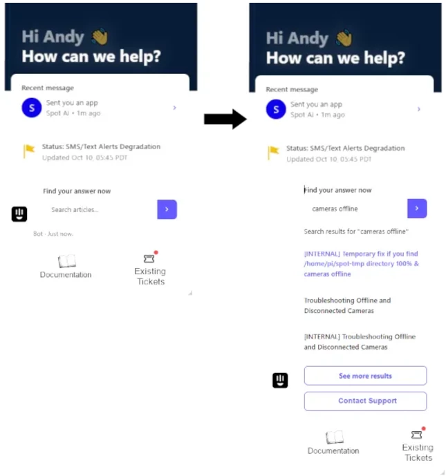


Customers are reporting that opening tickets can be confusing with too many clicks needed to get to their objective. Since every company need is different, I’d like the ability to tailor the UI to best suit our customers.
Examples:
- ‘Home’ menu pick is basically the same as the ‘Help’ menu, but displays featured KAs, degradation notices, and optionally prominently displaying customer maturity content. We could consolidate desired ‘Home’ functionality into the ‘Help’ menu to clean up the interface.
- ‘Help’ is useful because it shows all of the available KAs. But the name ‘Help’ can be confusing (customers seeking Help via a Support Ticket isn’t going to get satisfaction). We think that renaming ‘Help’ to Documentation would make things more obvious to our users.
- ‘Messages’ and ‘Tickets’ can be confusing. ‘Messages’ leads to the KB and/or opening a Support Ticket. ‘Tickets’ leads to existing tickets, not creating a new ticket. I believe that the mockup below will better distinguish these workflows. This should simplify the workflow, clarify the process funnels, and result in less clicks.
- Also, we might consider changing the link of the Existing Tickets to take them directly into their company’s Ticket Portal.
- Mockup, showing new landing page on the left & results page on the right: