


The new "From" header in Inbox chat takes up too much screen space | Community
Skip to main content
Submitted

The new "From" header in Inbox chat takes up too much screen space

  • August 21, 2026
  • 2 replies
  • 106 views

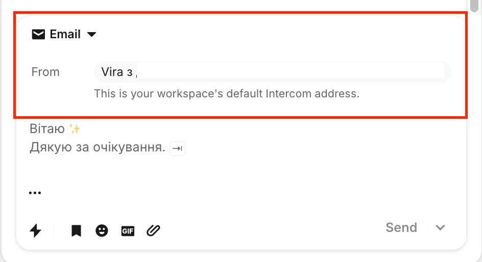
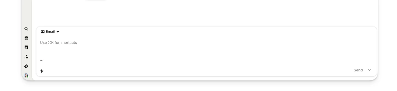
Recently, a new "From" field/line was added at the top of the chat panel with a customer. Unfortunately, this element takes up almost half of the visible screen area in the chat view.

While I understand this might have been introduced as part of a design refresh or to improve context visibility, in practice, it significantly hinders daily workflow:

  • Drastically reduced readable area: Agents now have to scroll constantly just to read brief message threads.

  • Slower response times: Managing multiple conversations becomes inefficient when key information and context are pushed out of the viewport.

Could you please consider making this header more compact, collapsible, or giving us an option to customize/hide it?
 

2 replies

Adam Warden
Innovator ✨
Forum|alt.badge.img+4

Hi Vira! 

I have always found the interface in Intercom to be a little too zoomed-in and claustrophobic. The workaround that I’ve always used is the zoom out feature most browsers have by pressing ctrl + - or cmd + -. I find it works wonders for me. Sorry I don’t have a proper resolution, but thought I’d share since it has helped me with this issue.


Forum|alt.badge.img+7

Hi ​@Vira, Seán here from the Fin technical support team 👋

I understand what you mean by this and thanks for sharing it. The best place to raise and track requests like this is our Community Product Wishlist. I'd recommend searching there first to see if a similar idea already exists, and if it does you can upvote it or add your comments. If not, you can create a new request here: Product Wishlist. This will allow the request to get processed correctly and you can get direct feedback and possible action from the related engineering team. Any questions on anything please let me know!