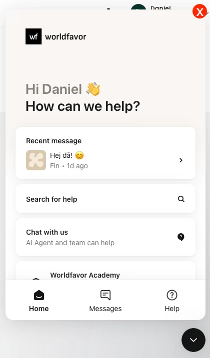




Many customers report difficulty closing the chat window after engaging with Fin or a support rep. Specifically:
-
User expectation: They intuitively look for an X button in the upper-right corner, a standard UI convention for closing modal windows or chat interfaces.
-
Current behavior: The only way to close the chat is by clicking the chat icon again in the bottom corner. This is not visually obvious or intuitive to many users.
This leads to:
-
Poor user experience: Causes friction and confusion, especially for new users or those in a hurry.
-
Increased support load: The issue is so widespread that the team has had to create a snippet in Fin to explain how to close the chat, just to reduce the number of repetitive questions.
-
Cognitive overhead: Users are left guessing, which breaks the otherwise seamless UX of the support flow.
Suggested solution
Introduce a visible "X" close button in the upper-right corner of the chat window (when expanded). Ideally:
-
It should follow conventional design standards (hover-highlighted, accessible).
-
Clicking it should minimize the chat, just like clicking the chat icon currently does.
-
Optional: Add a tooltip on hover to say "Minimize chat".