I was just wondering why the gradient color on the text turns out like this:
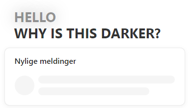
When other launchers look like this:


There is some wierd gradient color that is  applied to the greeting text which does NOT match the Introduction text. Is there a fix for this?

@Dusan I think you’ll find these differences might be related to choosing different background options i.e. image backgrounds vs gradient -- if you add a gradient image you can get the all white text option but when you switch to gradient you’ll get either the two tone gray like above or two tones of white.  

See this video for more info, hope it helps!


@Nathan Sudds Great video, and thank you for a solid explanation! Any tips on how to create a gradient og what tools you would recommend to use? I can see that you are not using one but are not having the grey area issue like i am having with mine, have you done something different?


Hey @Dusan! You'll find more on updating & customising the Messenger in this article from our Help Center ⬇️

Set up and customize the Messenger


Reply