Answered

Surveys to scale on mobile screen viewports

  • 6 September 2023
  • 1 reply
  • 100 views

With surveys is there any way to get them to work well on mobile devices when they are large format?

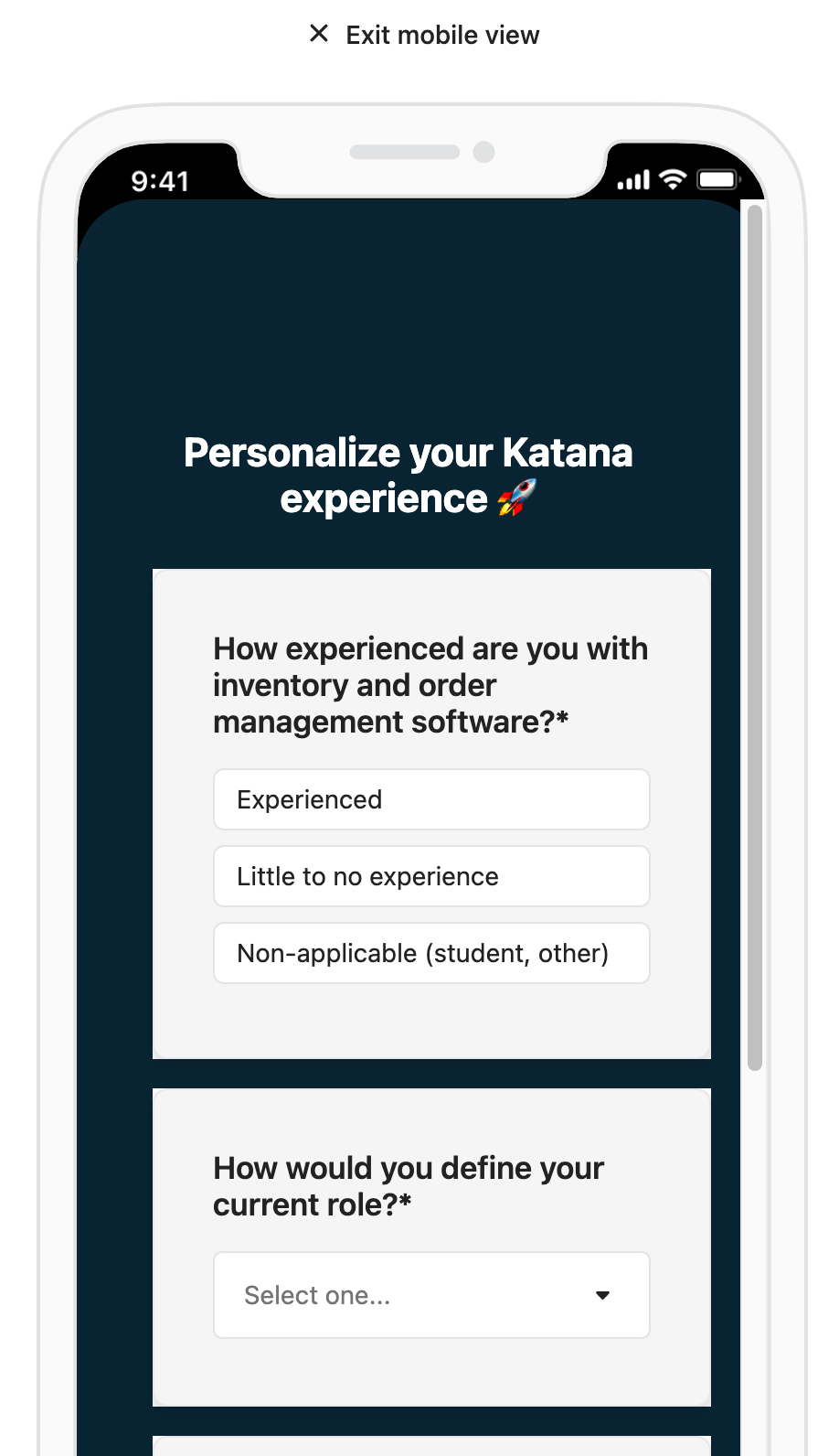
Here attached from Intercom is what the survey is suggested to look like on mobile view, which I presume is if you’ve done the work with SDK’s to make the survey push on an app.
It looks pretty tidy!

Mobile view from Intercom survey preview

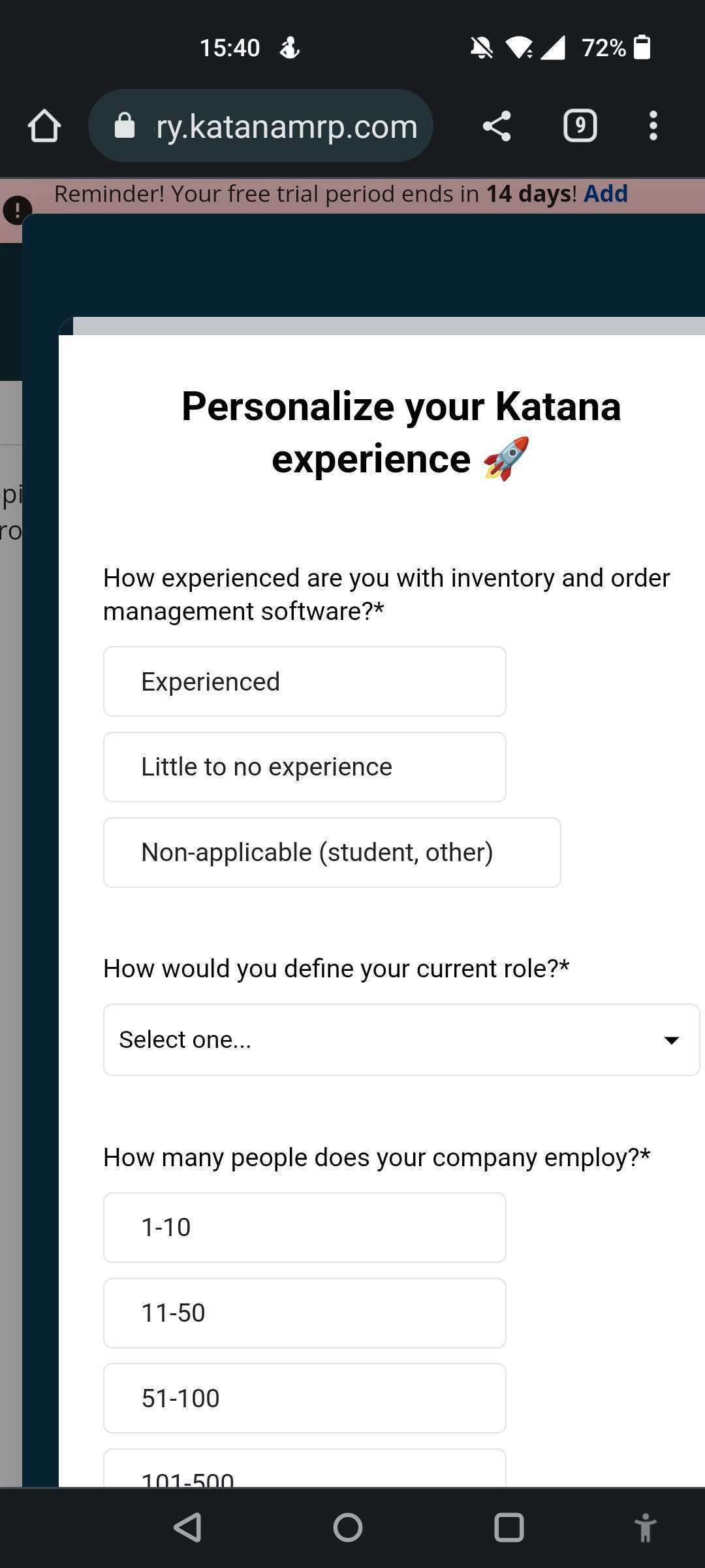
Below is an actual image of the same survey in real life on a standard Android phone. It doesn’t look as good, and on even smaller mobile devices some of the survey can’t even be read without scrolling _horizontally_ :| 

I am guessing it’s because it’s a mobile device accessing a web app and not an actual mobile app. 
Is this a correct assumption?

Secondly, is there any way to get the formatting to scale better on mobile. Something to match what’s shown in Intercom’s preview would be great. Any other suggestions I’d welcome too! 


icon

Best answer by Eden 13 September 2023, 20:58

View original

1 reply

Userlevel 3
Badge

Hey @Kurt Strang 👋 Eden from the support engineer team here.


I see that you spoke to our Support team within the Messenger about this one, but I’ll reiterate the answer below. 


When using mobile web, you should see that Surveys are still loading as expected and are being rendered to fit the screen. In this case it looks like the page may be being forced to load in 'desktop' mode rather than mobile, which could be a reason for seeing the strange formatting. We recommend confirming if the page is being loaded in desktop mode, as well as testing to see if this occurs on other devices as well. If you are still seeing issues with this, feel free to reach out in that conversation and we can continue troubleshooting with you. 

Reply