
Hello Intercom community! For those of you working in the Inbox, you may have noticed that Intercom recently changed their font choice to a typewriter-like font looking like this:
This new font also impacted the left side of the inbox where inbox numbers are mentioned. Unfortunately, the font they choose has a 0 with a . in the middle. Below is a screenshot showing the old 0 versus the new:
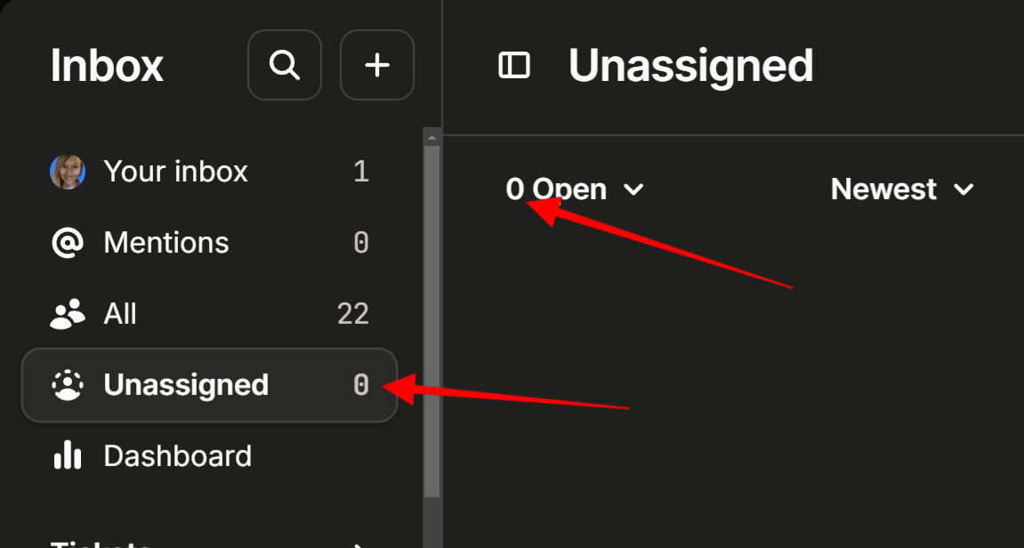
When you’re zoomed out and looking at the page in full, those new 0’s look an awful lot like 8s, leading to our team having to double check inboxes, etc.
Just curious to know if anyone else out there is not thrilled about this change and would like to see them revert back to the original font, which was much better/easier to read and causes less confusion.
Thanks!
