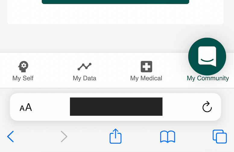
I have a real problem because on mobile devices, my app displays a bottom navigation/tab bar. As you can see in the picture attached, the standard mobile layout that you impose means that the messenger obscures the mobile menu:
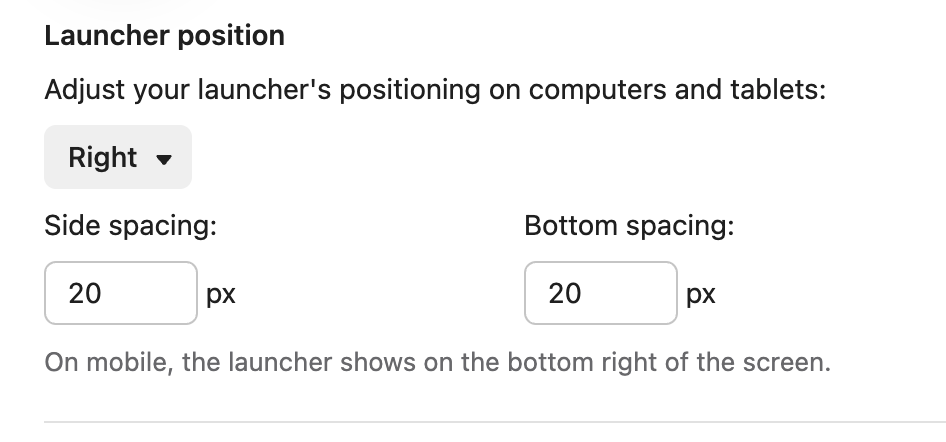
Even if I adjust the bottom spacing to say, 60px, it has no effect on mobile devices.
This is a real annoyance and I can't immediately think of a way to solve it. Surely other customers have experienced this issue before?
Best answer by Alexei
Any updates on this? We have mobile apps but not for our landing page - where the menu is still at the bottom for us - which obviously gets accessed through mobile a lot.
Hey @greg h! Daniel from Customer Support Engineering here 🔧
You can adjust the position of your launcher on mobile using a custom launcher. This allows you to essentially create a unique Messenger with full customisability 🙌 You can read the docs for setting this up on iOS here and Android here.
Not really as I'm running a cross platform Next.js PWA. Essentially, it's a fully responsive web application that runds as a PWA on web, iOS and Android devices. Why don't you allow the user's custom positioning (padding/spacing) to get applied on mobile? It seems everyone building a PWA is going to run into this issue if they use a layout with a bottom tab bar. I might try to write a CSS override using a media query to try and override your default positioning on mobile (which appears to always be 20px vertical and 20px horizontal.
Thanks for your response @greg h! I understand now why this wouldn't work for you. Custom positioning on mobile is designed to be implemented through our SDKs, so while it is possible to change, it won't be possible to apply for a PWA. On mobile devices, this will always be, as you mentioned, 20px vertically and horizontally detached from the bottom-right corner of the screen.
This seems like a super useful feature for other users who are building an app like yours! Please drop it in our Product Wishlist Group so we can hopefully see this implemented down the line 😊 Thanks!
Had a similar frustration with web chat --- the chat box dissolves and we have floating bubbles. These bubbles cover up buttons on our website. Users then have to exit out of the intercom chat entirely to view / use our site.
Any updates on this? We have mobile apps but not for our landing page - where the menu is still at the bottom for us - which obviously gets accessed through mobile a lot.
We need to dynamically move the Intercom icon on our mobile site but not desktop. On mobile it materially interferes with the core functionality of the app. What is the reasoning for not allowing this?
Y'all let's rally at the HQ steps and demand this change. Fr fr this is frustrating AF. PWA is super common for MVP with no code et al., and intercom is designed for early stage. Yelp!
Oh yeesh.. I’m hitting this issue as well and thought for sure it was an issue for us. However, I'm shocked to read that the javascript SDK’s `vertical_padding` only works for desktop browsers?!
Like others, our mobile web view has our nav at the bottom of screen which then causes issues for intercom widget. I hate to have to create custom CSS that overrides this since this should simply be supported in the javascript SDK settings.
Can confirm that the solution posted earlier does indeed work to target those CSS classes and the notifications iframe.
Any updates on this? We have mobile apps but not for our landing page - where the menu is still at the bottom for us - which obviously gets accessed through mobile a lot.
Any updates on this? We have mobile apps but not for our landing page - where the menu is still at the bottom for us - which obviously gets accessed through mobile a lot.
... our current workaround, overwriting global CSS.
Great workaround
Just used this to move the launcher position on a website where we have installed intercom into the head code of a third part community site (circle community)
For me, this solution doesn’t work. Yes, on the first render everything is fine, but when I open the chat and then close, the launcher goes back to its old position. Has anyone managed to solve this problem? Quite a lot of time has passed, but Intercom still hasn’t fixed it.

 This is a real annoyance and I can't immediately think of a way to solve it. Surely other customers have experienced this issue before?


